Website Redesign for Professional Association
Creating a new website experience for the American Society of Anesthesiologists (ASA).
Role
UX Designer and Researcher
Team
1 UX Designer.Researcher, 1 Content Strategist, 1 Lead Visual Designer, 3 Developers, 1 Project Manager, 1 Sales Lead
Tools
Sketch, Photoshop, Microsoft Office, Post-it Notes, Starbucks Gift Cards
Overview
The American Society of Anesthesiologists has been an advocate for the practice and profession for over 100 years. as part of initiating a brand makeover, they needed an update to their existing website and associated properties. New leadership within the organization desired to completely overhaul their site in favor of a more modern, and trendy design. Partnering with a third-party brand agency, we were tasked with aligning a digital brand and site architecture with the new mission and vision of the ASA.
As the UX design director on the project, I partnered with content strategists, visual design directors, technical architects, and developers in researching, designing, and delivering the new site. Primarily, I co-led research with our content strategist, designed and developed information architecture for navigation, and created a complete set of wireframe models for testing and design guidance. Handing over to our visual designer, I collaborated with our visual designer and the branding agency to help realize the new look and feel as well as oversaw QA on development to make sure designs were delivered accurately.
Interviews
During the ideation phase of the project, we conducted user interviews to gather and validate requirements, build new personas and to inform the design. Participants were recruited from operational staff, the governing board, and practitioners in the field. Interviews were a mix of in person at the headquarters and remote via video and telephone conferencing.
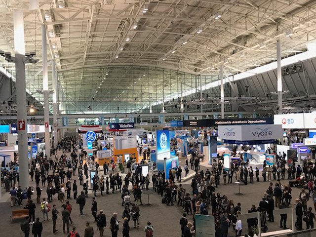
Challenge: practitioners had very little time available to participate. Interviews took weeks to coordinate. We had an opportunity to attend their annual conference and were provided access to attendees for additional guerrilla interviews throughout the conference. This included ad hoc interviews at their opening reception focused on new practitioners and students, as well as on the floor interviews and testing described below.
Findings
Continuing education is a primary driver for membership in the society.
Getting to the supporting materials and ease of enrolling in courses were most important.
Practitioner guard their time closely and will not spend extra effort finding the information they need.
Information architecture and ease of navigation were fundamental to their experience.
Leadership and membership were not initially aligned on objectives
Leadership wanted a revolution with their site. Members just wanted the content to be easily accessible.
Wireframes
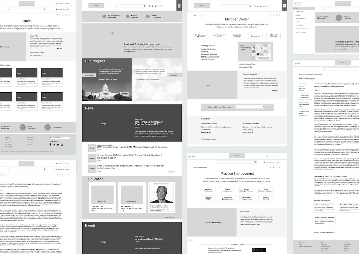
I began the design process with low-fidelity wireframes to accelerate decision-making through visualization. My sketches were based on the initial user interviews, the business goals, and the competitive assessments me conducted. The biggest challenge was in wrangling the information architecture due to the scale of their articles and publications. Additionally, as an education-focused organization, surfacing up training and continuing education programs were vital to the overall business.
I went through several iterations of wireframes to model out different navigation and content presentation scenarios. We ultimately landed on a non-conventional navigation approach for desktop leveraging the hamburger menu structure and trying out different alignments and configurations for testing.
Prototype Testing
Using the wireframes created to date, I built a clickable prototype to test with the audience. Again, as their time was a challenge to schedule, we used our attendance at their annual conference to set up a table on the show floor and intercept attendees to review the prototype. The addition of Starbucks Gift Card incentives helped bring participants in during the day. IT was probably the best use of the time in an environment of curious and engaged participants that were already their for education and to see what was new in the field.
UI Design
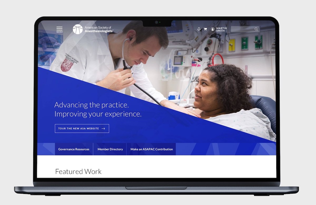
Testing validated our information architecture. Our next step was to craft a new visual design for the site. ASA had split this effort between us and a third-party branding agency. While the branding agency did not address Web UI, we used their framework as a starting point. Additionally, we conducted visual branding exercises with core operational team to define their online brand more fully. One major shift was navigation placement. While tested with a right hand navigation menu, this was always unconventional and we decided to fallback to a more conservative placement on the left side of the screen. Additionally over time, ASA added a horizontal main navigation back to the top of the site after the initial deployment.
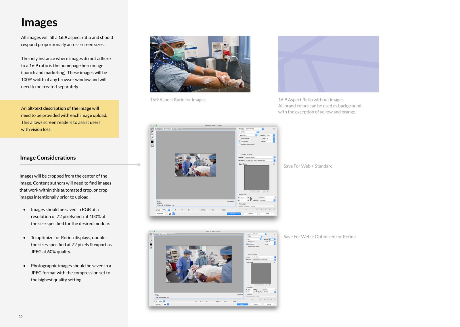
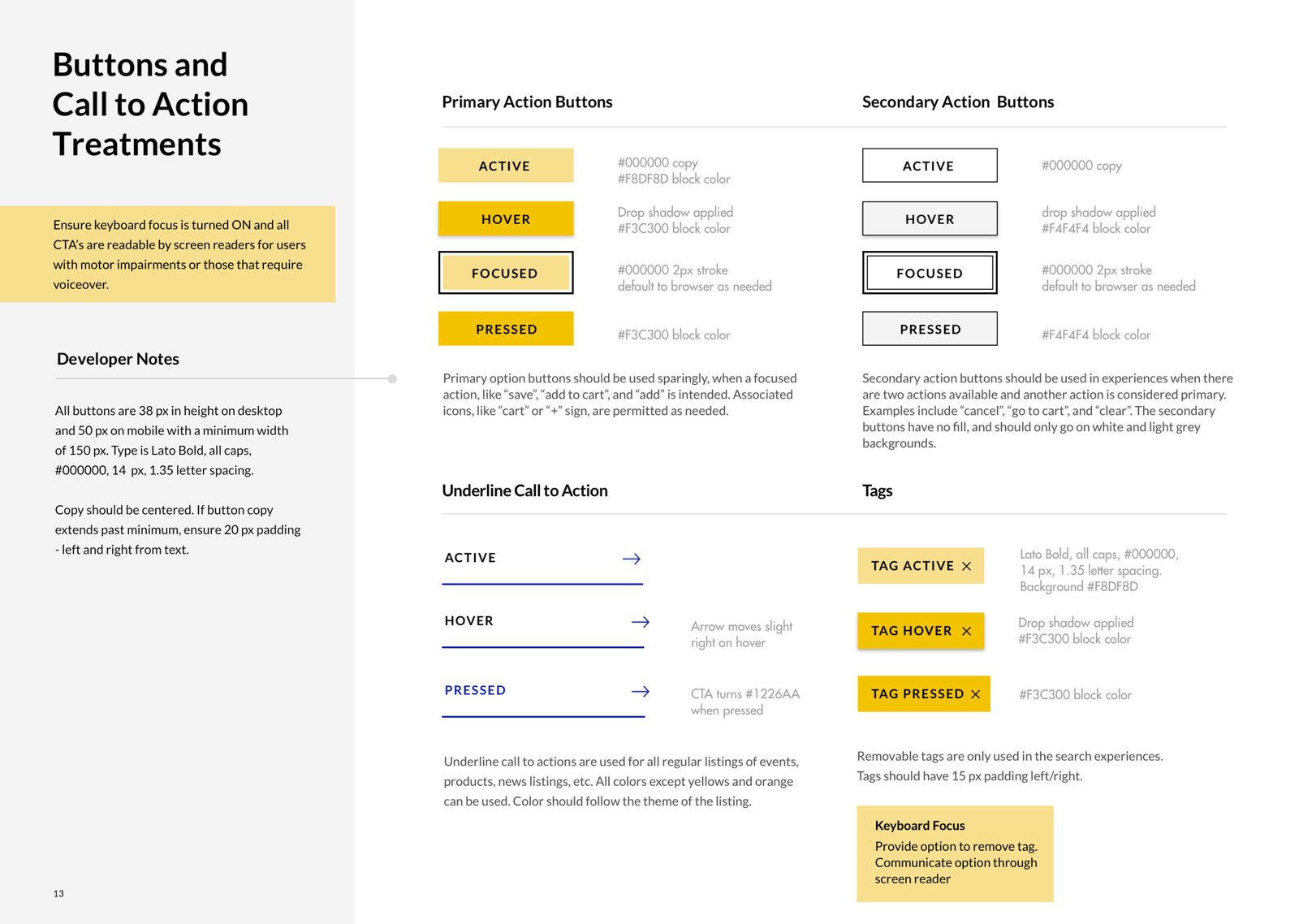
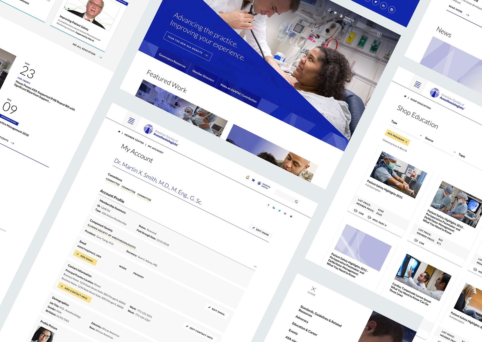
The result of the new UI was a bold departure from the previous, much more conservative layout. Opting for larger contextual images as page heroes and a strong design system for modules and components helped to make a strong statement that this was the new ASA. Additionally, a radically update logo provided cues to our design system in shapes and presentation that is seen throughout the new site. As a final deliverable for the ne UI, Ann updated site styleguide was created to help inform ongoing evolution and maintain consistency as new articles, sections, and features are brought onboard.
